Developing a Personal Style

Blog, fashion

Developing a Personal Style is a challenge.

Who am I?

What do I like?

What looks good on me?

What color looks good on me?

But by breaking down each of these questions into a simple alignment and quiz, it becomes much easier to begin to recognize patterns.

Who Am I?

Defining yourself can be as simple as analyzing your interests and hobbies to looking at your Astrological chart and Bryer-Miggs personality test.

Who you are is defined by your own personal values. Here’s an easy template to help guide you on defining yourself. I recommend getting a piece of paper, or opening a notepad and working off of this quiz.

  • Are you religious or spiritual?
  • Yes Religious
  • Yes Spiritual
  • No, not Religious
  • No, not Spiritual
  • Are you more conservative or are you more creative? (This has nothing to do with political stance)
    Extremely Conservative, Conservative, Moderate, Average, A little creative, Creative, Extremely Creative
  • How much does your appearance matter to you?
    Not At All, A little bit, Average, A lot, Extremely
  • Do you like color?
  • Yes
    No

What do you like?

What do your interests say about you? Your interests will often reflect what you buy, what you’re drawn to, and what you’ll wear.
An anime fan who is interested in fitness may be drawn to leggings and hoodies with characters on them, while a yoga instructor who is conservative may wear more traditional athleisure clothing.

Write a list of your interests and create a word map to see if there are any connections you can make. It also helps to look at your current closet to see if there are any repeating patterns, colors, or shapes that appear.

What Looks Good on Me?

Often styles you like or see in magazines, or on TikTok, Instagram, or Pinterest are reflective of current trend cycles. Which often only flatter a small portion of the population. (I can’t pull off cargo pants no matter how hard I try.)

There are a few ways to figure out if something looks good, flatters you, and fits your style.

Color


If you like color, then you’ll probably see more in your wardrobe. But to find out if that color suits you, look to the blood vessels in your wrist.
Do they appear cooler (blue/purple toned) or warmer (Green/blue) toned? Or do they appear mixed between?

Cooler tones:

Look better in silver, jewel tones, and deeper shades.

Warm tones:

Look better in gold, peach, orange, sunset shades.

Neutral tones:

A blend between the two!

Color tones based on shade.

Find Your Body Type (Part One)

Everyone has a different body type and structure. All bodies fit into a different category. There is a lot of research into this, but I’ll break down the basics.

Read More at Healthline:

Measure your shoulders, bust, waist, hips with a measuring tape like this one, and take those measurements to see which shape matches you best below. Next week, I will break down what clothes and styles flatter different body types!

Rectangle:
Your hips, bust, and shoulders are all roughly the same size.

Triangle:
Shoulders and bust are narrower than hips. Slim arms and defined waist.

Spoon:
Larger hips, bottom-heavy. Defined waist. Can carry weight in upper arms and upper thighs.

Hourglass:
Legs and upper body proportionate.
Slightly rounded shoulders.
Defined waist with hips and bust equal size (or near equal)

Top Hourglass:
General to hourglass with a larger bust.


Bottom Hourglass:
General hourglass shape, but larger hip measurement.

Inverted Triangle:
Larger shoulders and bust, narrow hips.

Round:
Large/full bust, full midsection, narrow hips.

Diamond:
Broader hips than shoulders, narrow bust, fuller waistline.

Athletic:
Not curvy. Shoulder and hip measurements are the same.

You can take all of this information and work to form an ideal fashion style that suits you and represents who you are.

If you’d like help with this, contact or leave a comment below.

A Brief Overview on Color Theory (CMYK and RGB)

Blog, fashion, Goals and Education

Color theory is a process by which creativity and science mesh together. It’s an important thing to understand for good design and something that will dictate how a finished object can look.

The colors that make up the prime three are:
Red or Magenta.
Cyan (a shade of blue)
Yellow. Prime is equal to 3.

Primary Colors: RGB. Painting and Web-based projects should be worked on in this format.
Red, Yellow, (Royal) Blue.
These usually used are considered “additive” based colors, as you can mix them together to create another color, and relies on how light reflects through them.
According to Pantone:

“The visible color spectrum, what we know as the rainbow (RGBIV), encompasses light wavelengths from approximately 380 to 720 nanometers and breaks down into three primary colors: red, green, and blue. We can mix these three colors in various combinations to create millions of beautiful colors. When we mix them in equal quantities, we perceive the color as white. “

Pantone Color IQ

Design Primary Colors: For printing. CMYK uses a subtractive method.
Cyan
Magenta (Or Circadian red)
Yellow
Black.
This format is more or less meant to be used for printing processes, but you can also use it for traditional art forms if you so choose.

The depth of color theory is exhausted in the transition of light, and how electromagnetic waves move. In 1704, Issac Newton published the primary color theory by studying the wavelengths of light and how they reacted on prism surfaces. While his conclusion differed from Munsell’s mathematical results, neither has been discredited.

There has been discussion that Munsell’s theory can be expanded on into the realm of how light and dark play together. I question if it’s possible to develop a digital algorithm that could inherently help us understand light and art better?
We have:
Hue, Value, Brightness, Saturation, Darkness, and thus the opposite. “White” isn’t even a color, and the term we really should be using is “bright or dark”. This is where shades and value come into play.

Shades and Values:

Within hair alone, we use “levels” to demonstrate bright to dark. 0-Black. 10 to 12-White/Light/Silver.
If we are only able to see the colors up to a “level 10”, could there be further colors beyond our eyesight that we haven’t evolved to see? After all, dogs only see in shades of grey, cats and owls can see at night. Paper is used to demonstrating “Whiteness”, but if you look at all the varying levels of light, this can change from white to off-white, to appearing yellow or silver, based on hue, undertones, and the colors that we see around us.
*Tip, go to a salon with good light sources that use both artificial and daylight (Windows). It’s the easiest way to find a color that should match your skin tone easier with your colorist!

If Isaac Newton used the musical notes as a representation of ROY-G-BIV, could it be possible that a combination of translating the musical notes to math, would lead us down a new path of brilliance within understanding art and color theory? Munsell’s use of geometry seems to be a key clue in understanding this.

One of the ways we found color was through using prisms, a geometric-shaped piece of glass or crystal, and having light refract and shine through it. This allowed us to gain a better understanding of the wave lengths of how color and light work together. But in the art world, if we already have access to all the colors, then how can we expand on it? How do we use it to benefit our own creations?

I will be posting a follow-up piece on how to use color theory to your advantage as an artist so be sure to subscribe so you get email updates when I post something new. Let me know your thoughts, personally, I find color theory absolutely fascinating.

Learn More Here: handprint.com

Learn more here: huevaluechroma.com

Firmoo Glasses Order

Blog, fashion

During April I had to see an optometrist for the first time. I had a pretty severe cut across my eyelid, and was dealing with some pretty intense pain. I also was diagnosed with astigmatism, and dry eyes, and a slight vision problem that glasses will help with.

Well, I order a pair from their office, but those haven’t been mailed yet, and because I feel like it’s better to see than be in pain, I found a site that sells glasses for pretty cheap.

That’s Firmoo.com.
Firmoo sells glasses for every gender, and age, and in a variety of styles.


Basic Goth Look

Blog, fashion

Hello fellow makeup geeks! This is my first makeup video where I try to talk-while doing makeup. Makeup is a huge passion of mine, and I absolutely love doing it. Music is royalty free. 🙂

Foundation: BH liquid foundation in nude

Lips: Burt’s Bee Rhubarb lip shimmer

Sugarpill in Hijinx

Eyes: BH Take me to Brazil Pallet

Lollipop Eyeliner in Black

Mascara: Lottie London #lashgoals

Top 3 Holiday Looks

fashion
Look One:
Plaid dress from Forever21
Green slouchy cardigan
Maroon Doc Martens
Black Tights
Pair with your choice of jewelry and hair to make it match your style.
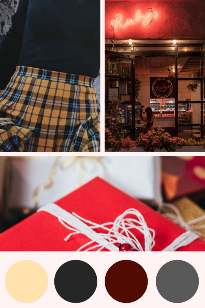
Pleated skirts are a ‘staple’ in my wardrobe. This season I’ve seen them everywhere.
Get one that suits your style in any shade! Add in ruby red touches and holly berries for a special festive tie in.
This evening gown comes from JJ’s House.
Pair with some fun heals and light necklace.